Here’s a small guide on how to manage media queries with Sass.
Lets assume that we have 5 Media Queries. They’re usually all clumped at the end of your CSS document, every media query is declared once and the relevant code is inside it. This is how it’s usually done, but there might be a better way.
Sprinkle them in to your code like any styling
When using Sass, instead of putting them at the end, you can pepper the media queries throughout the CSS where they’re needed.
Apply generously like any styling:
.single .column1 {
  width: 100%;

  @media (min-width: 640px) {
    width: 66.66%;
  }
}
Sass outputs the following CSS:
.single .column1 {
  width: 100%;
}
@media (min-width: 640px) {
  .single .column1 {
    width: 66.66%;
  }
}
Use Mixins and make Sass do the heavy lifting
There’s one problem, though: you have to define the media queries in many places, making refactoring laborious.
We can write a Sass mixin:
@mixin breakpoint($point) {
  @if $point == xxl {
    @media screen and (min-width: 1680px) {
      @content;
    }
  } @else if $point == xl {
    @media screen and (min-width: 1443px) {
      @content;
    }
  } @else if $point == l {
    @media screen and (min-width: 1023px) {
      @content;
    }
  } @else if $point == m {
    @media screen and (min-width: 767px) {
      @content;
    }
  } @else if $point == s {
    @media screen and (min-width: 639px) {
      @content;
    }
  }
}
This code is from this site, it was it styles the column you’re
reading:
.single .column1 {
  @include breakpoint(min-medium) {
    width: 66.66%;
  }

  @include breakpoint(min-extralarge) {
    width: 60%;
  }
  width: 100%;
}
What about performance?
It’s probably a bit more code, but nothing to worry about.
Go mobile first, use min-width not max-width
Probably a preference thing but min queries feel somehow righter.
Do stuff to everything that is larger than 640px:
@media (min-width: 640px) {
  /* Effects to everything larger than this */
}
Define Media Queries in ems
Pressing ⌘ + can sometimes ruin the layout of your site. Defining Media Queries in ems will change that and makes the website work when zoomed.
Zoomed in with px Media Queries:
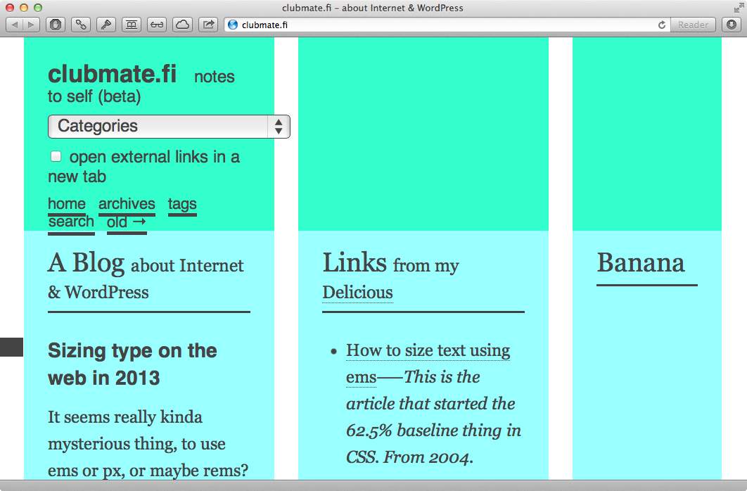
And zoom when using em media queries:
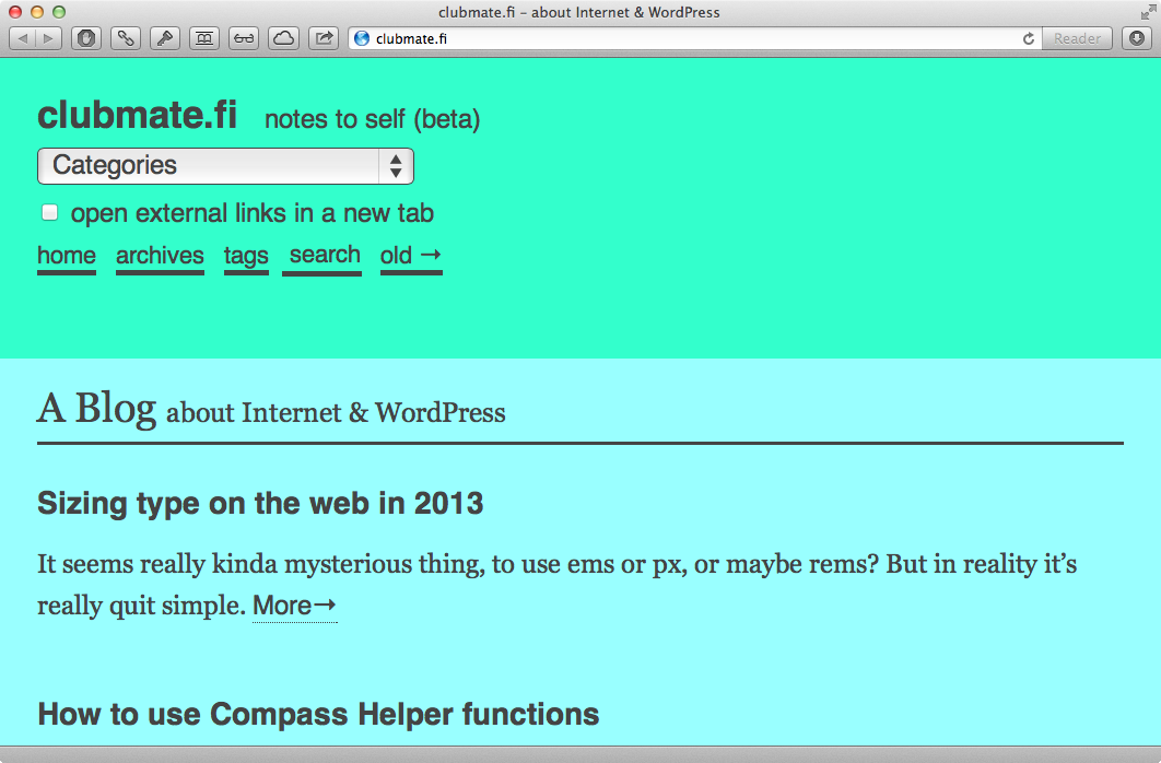
This way browser adapts to the zoom like it adapts to the screen width.
Here’s an article on it: The EMs have it: Proportional Media Queries FTW!
How do I get the em values then?
Target size divided by current base size.
If you’ve set html font size to 100%
(more on that):
html {
  font-size: 100%;
}
Then your
- Current base size is
16pxand - Target size is the
pxvalue you want to convert toem, let's say it's640px(iPhone width).
640 / 16 = 40Automate em conversion with Sass
A conversion function:
@function pxToEm($size) {
  $remSize: $size / 16px;
  @return #{$remSize}em;
}
Then use it in your breakpoint mixin (mentioned upper):
@mixin breakpoint($point) {
  @if $point == xl {
    @media screen and (min-width: pxToEm(1680px)) {
      @content;
    }
  }
}
Or you can just learn to write ems.
Summary
I has been nice to discover how Sass is making CSS writing easier.