For instance, in this blog not the case anymore, the main article
is fluid width, and on large screens it can be up 970px wide. That makes the
line length too long to be readable, so the paragraphs have to be narrower. But,
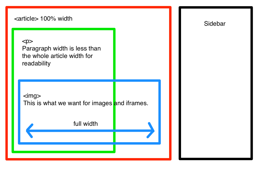
the images could be wider than the paragraph (since we got the screen real
estate), but they’re inside the paragraph. Here’s how to solve that.
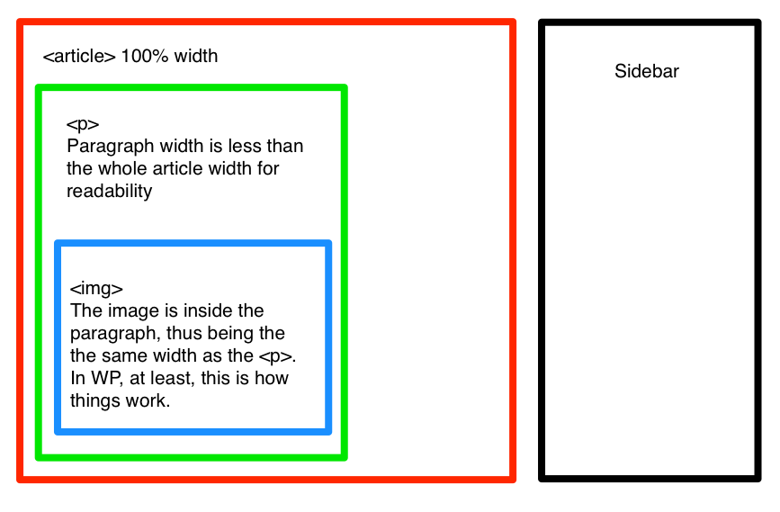
This is what we get:
This is what we want:
Making images wide
If we look at the code, we’ll see that the images are inside a fixed width paragraph:
<p>
  <img alt="" src="blog-image.jpg" />
</p>
The element can be unwrapped with jQuery:
$('article img').unwrap()That’s all for now.