A versatile React component that handles icons and icon links while meeting accessibility requirements.
Different ways icons are used
Icons can be divided roughly into two buckets:
- Purely decorative eye candy icons, usually coupled up with text.
- Icons that have a meaning, usually replacing text.
For example, the info icon in the "info box" below is purely decorative. The text inside tells the user everything they need to know:
But the icons in this example table have a meaning, and there’s no text coupled up with them:
| IE | Safari | Chrome | Firefox | Opera | |
|---|---|---|---|---|---|
| mp4 | |||||
| webm |
Now that we know what we need to do, let’s try to make it happen.
Writing the icon component
The example code expects the SVG icons to be a React component, like so:
const ArrowRight = props => (
  <svg viewBox='0 0 16 16' {...props}>
    <path d='M15.5 8L8 .5V5H0v6h8v4.5z' />
  </svg>
)A basic example with the bare minimum amount of code (scroll down for a more embodied example):
import { Wrap, VisuallyHidden } from './styles'

const Icon = ({ Icon, label }) => (
  <Wrap>
    <Icon aria-hidden focusable='false' />
    {label && <VisuallyHidden>{label}</VisuallyHidden>}
  </Wrap>
)
The relevant bits:
- aria-hidden
This hides it from screen readers, they don’t really need the icon for anything, since the label is outside the icon (the hidden element).
- focusable="false"
Because the icon is hidden, there’s no need for anyone to tab into it. This is a diminishing issue. It’s only a problem in Internet Explorer, but we might as well fix it.
- VisuallyHidden
If the label is provided, have it available for screen readers, but hidden from eyes.
Icon component usage
When using the Icon component, add the label if the icon is not coupled with text:
import Icon from '../components/Icon'
import MyCompanyLogo from '../components/MyCompanyLogo'

const App = () => (
  <Logo>
    <Icon icon={MyCompanyLogo} label='Logo' />
  </Logo>
)
Skip it if you already have text in the element:
const App = () => (
  <NoteBox>
    <Icon icon={Info} />
    Did you know that SVG stands for Scalable Vector Graphics?
  </NoteBox>
)
Without visually hidden element: use aria-label
There’s a built-in way to label elements: aria-label. But keep in mind
that aria-label is a less robust way to do this than putting the label inside
the <VisuallyHidden> element. Because aria-label
has some internationalization issues,
and it’s not as widely supported (thanks Hugo for
the valuable research).
Aria-label in use:
import { Wrap } from './styles'

const Icon = ({ Icon, label }) => (
  <Icon aria-label={label} focusable='false' role='img' />
)
About that role attribute:
If you are using embedded SVG images in your page, it is a good idea to set
role="img"on the outer<svg>element and give it a label. This will cause screen readers to just consider it as a single entity and describe it using the label, rather than trying to read out all the child nodes. MDN
Icon buttons and icon links
Icon buttons and icon links are common UI patterns. In that case, the same rules
apply, but the wrapping component will be button or an a.
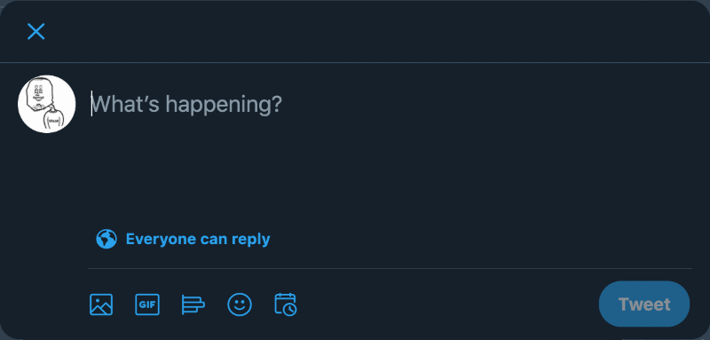
Twitter is a good example of a UI with many buttons that are only icons:
Another classic example is the search button next to a search bar:

Below is some basic React code for an icon button component. It is not much
different from the earlier icon component, but it handles button clicks or pass
in an href attribute if it’s an anchor, or to if it’s a router link:
import { Button, VisuallyHidden } from './styles'

const ComposeButton = ({ Icon, label }) => {
  return (
    <Button
      onClick={() => {
        /* Do stuff */
      }}
    >
      <Icon aria-hidden focusable='false' />
      {label && <VisuallyHidden>{label}</VisuallyHidden>}
    </Button>
  )
}
Button with a loading spinner
A useful UI pattern is to have a spinner animation appear in the button after it has been clicked. The spinner is just an icon that is spun with a keyframe animation (click it):
The spinner component
If a component will change, that is, if it introduces new elements or changes
its value, then aria-live attribute has to be used so that the screen reader
will announce the changes (see more on that below):
const LoadingButton = () => {
  const [isLoading, setIsLoading] = React.useState(false)

  const handleClick = () => {
    setIsLoading(true)
  }

  return (
    <Button
      aria-disabled={isLoading}
      isLoading={isLoading}
      onClick={handleClick}
    >
      {isLoading && (
        <SpinnerIcon aria-live='assertive' icon='spinner' isBlock={false} />
      )}
      Submit
    </Button>
  )
}
Here are the highlighted bits explained:
- aria-disabled
The button should be disabled when loading.
Note that the
disabledattribute should not be usedbecause that will hide the button from assistive technologies. It should instead be deactivated with CSS. That’s why the
isLoadingprop is passed to the styled component.- aria-live="assertive"
JavaScript can update components on the page without reloading it. To a sighted user, the changes are obvious, but not to someone using a screen reader.
aria-livemakes the component to be a "live region", and tells the screen reader that the icon button has just changed.arial-livecan have three values: 1)offthe changes are not announced. 2)politethe change is announced the next suitable moment. 3)assertivethe change is announced immediately. This should only be used for important announcements, such as errors. In this case, we’re telling the user that a form is being sent.
Confusion with aria-role and aria-live
I think there’s a bit of confusion about aria-role="alert" used in conjunction
with aria-live="assertive" (or it’s just me), I’ve seen these two being used
together, but as I was researching this post, the general consensus is that
aria-live="assertive" has an implied value of aria-role="alert", so it’s not
needed to be defined.
Btw, this is a good video explaining it quite well (taken from cccaccessibility.org article called "Using Aria-live"):
Also an example in
a w3.org article
implies the similarity of these two attributes ...
.role=alert which is
equivalent to using aria-live=assertive
The spinner component styling
When isLoading is true, the button should look disabled (in this case I just
played with the opacity), and all the pointer-events should be turned off. You
could set the cursor to wait or not-allowed, but since we’re setting
pointer-events to none, that won’t have any effect.
const Button = styled.button(props => ({
  marginBottom: '16px',
  opacity: props.isLoading ? 0.5 : undefined,
  padding: '5px 10px',
  pointerEvents: props.isLoading ? 'none' : undefined,
}))
Soup it up
The above code works but is super basic and doesn’t reflect the real-world usage.
Here are a few things you could consider adding to make it more usable:
- Pass in the
classNameso it can be styled with styled-component or Fela etc. - Make map of the icons, so that only an icon name can be passed in, rather than the actual icon component. This makes it more design system-esque.
- Predefined set of sizes.
- Give the icon a fill of
currentcolor, so it will inherit the color from its wrapping element. - Define a subset of colors from your palette to be passed into the icon.
- Possibility to display the icon as a
blockorinline-block.
import React from 'react'
import PropTypes from 'prop-types'
import ArrowRight from '../icons/ArrowRight'
import Book from '../icons/Book'
import CheckMark from '../icons/CheckMark'
import Cross from '../icons/Cross'
import Info from '../icons/Info'
import { Wrap, Label } from './styles'

export const icons = {
  arrowRight: ArrowRight,
  book: Book,
  checkMark: CheckMark,
  cross: Cross,
  info: Info,
}

const sizes = {
  small: '16px',
  medium: '24px',
  large: '32px',
  extraLarge: '40px',
}

const colors = {
  red: '--red',
  green: '--green',
  gray: '--gray-dark',
  black: '--black',
}

const Icon = props => {
  const { className, icon, isBlock, label, role, size } = props
  const IconComponent = icons[icon]

  if (!IconComponent) return null

  return (
    <Wrap
      className={className}
      color={colors[color]}
      isBlock={isBlock}
      size={sizes[size]}
    >
      <IconComponent
        aria-hidden
        fill='currentcolor'
        focusable='false'
        role={role}
        title={label}
      />
      {label && <Label>{label}</Label>}
    </Wrap>
  )
}

Icon.defaultProps = {
  color: '--black',
  isBlock: true,
  size: 'small',
}

Icon.propTypes = {
  className: PropTypes.string,
  color: PropTypes.oneOf(Object.keys(colors)),
  icon: PropTypes.oneOf(Object.keys(icons)).isRequired,
  isBlock: PropTypes.bool,
  label: PropTypes.string,
  role: PropTypes.string,
  size: PropTypes.oneOf(Object.keys(sizes)),
}

export default Icon
SVG icon acid test
I mentioned in my other icon post earlier, that
icon fonts are finicky to size correctly. SVG icons aren’t nearly as bad, but
one annoying thing I often have to deal with is alignment; sloppily exported
icons align in a different way. Because the icon is bigger, or it has a height
and the other one doesn’t, or the viewbox is off or missing etc. Then you have
to tweak styles per icon, terrible.
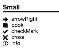
To get rid of this, make an alignment acid test for the icons by placing some text next to the icon in your design system. Don’t force the alignment with flex-box or transforms etc. This way, at a glance you can see if some of the icons aren’t aligning properly, and you can go into the SVG and fix it. That you never have to worry about misaligned icons again.
Dynamic icon sizing
In my example I’ve defined the icon size in pixels, because I just like the
exactness of that. But another way to handle that is to use 1em and the height
and width of the icon, this way the icon will inherit the text size from its
parent component. For example, an icon inside h2 title would be proportional to
the text size.
const ArrowRight = props => (
  <svg viewBox='0 0 16 16' height='1em' width='1em' {...props}>
    <path d='M15.5 8L8 .5V5H0v6h8v4.5z' />
  </svg>
)
React icon component demo
Here’s a demo of the above mentioned icon component.
Conclusions
In the end, the rules related to icons are pretty simple: most of the time they’re hidden from screen readers, and if label is needed, put it inside a visually hidden element.
The better icons are prepared, the easier they’re to use, because you can trust them to be the same size and align the same way. Put in that effort in the beginning and you’ll thank yourself later.
Also, check my post about the technological singularity of icons in web.